
Color in the Landscape: How We Design for Beauty, Mood, and the Bay Area Environment
Color is one of the most powerful tools in landscape architecture — and one of the most misunderstood. It’s tempting to treat a garden’s palette as a matter of personal taste: which flowers you love, which shades make you smile. And while personal preference plays a real role, the way we approach color at Montgomery Robbins goes much deeper than that.
Color in the landscape is a design tool. It shapes how a space feels, how large or intimate it reads, how your eye moves through it, and how the garden evolves across seasons and years. When we begin a new design, color is one of the first considerations — not a finishing touch, but a foundational element woven into the structure of the entire landscape.
That distinction lives in the principles, the practical decisions, and the way the Bay Area’s unique environment informs every palette we design.
How Do Landscape Architects Use Color Theory?
Color theory in landscape design draws from the same foundational principles as any visual art — but with one dimension no other discipline requires: time. A painted wall stays the same color year after year. A garden does not.
The framework begins with color relationships. Analogous colors — those sitting adjacent on the color wheel, like blue, blue-green, and green — create harmony and visual flow. Complementary colors, such as purple and yellow, create contrast that draws the eye. Monochromatic palettes, built from a single hue in varying shades and tones, deliver elegance and calm. Beyond these relationships, we work with three properties that determine how any color behaves in a space: value (light vs. dark), saturation (intense vs. muted), and temperature (warm vs. cool). These properties shape not just how a color looks, but what it does — how it affects mood, whether it advances or recedes, and how it reads across varying distances and light conditions.
Color also affects psychology in consistent, measurable ways — something we apply deliberately in every project:
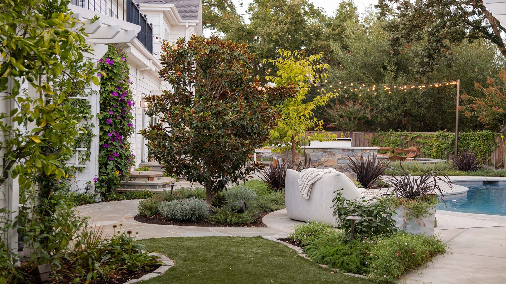
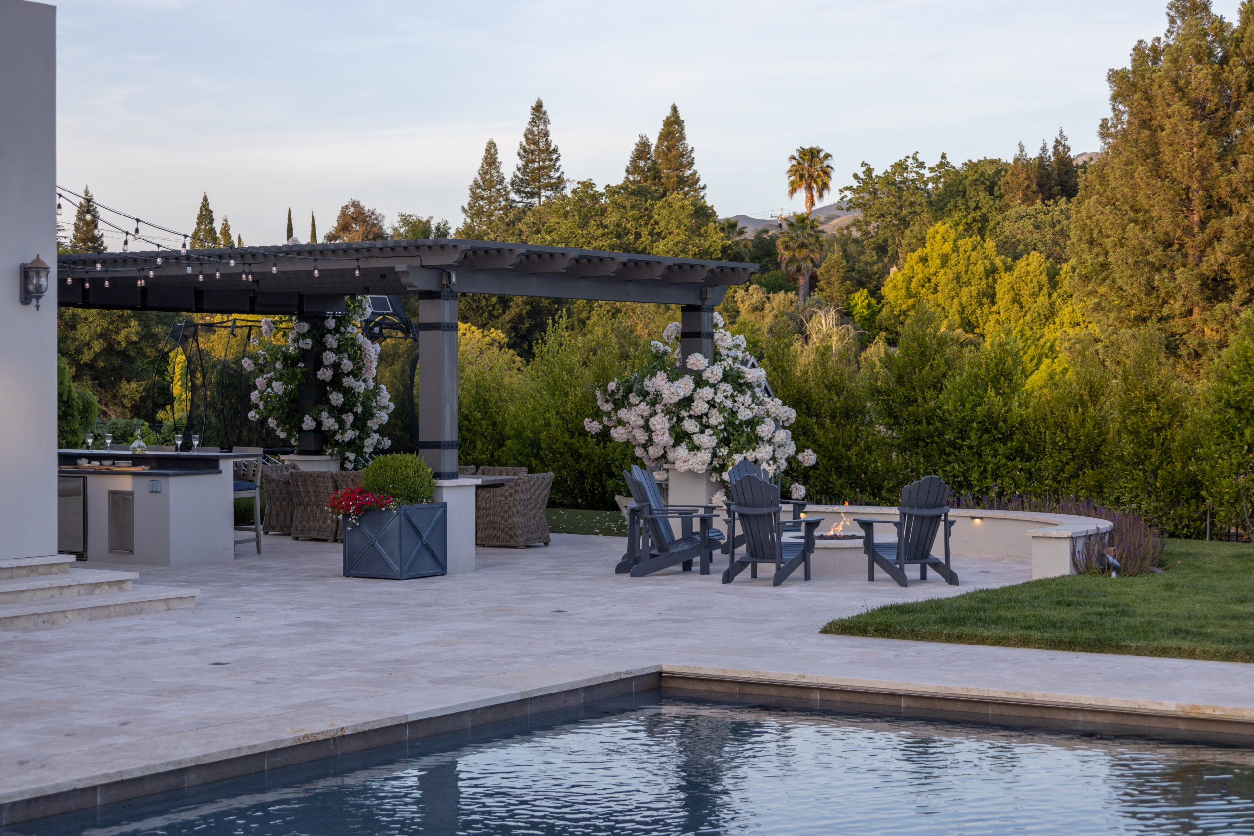
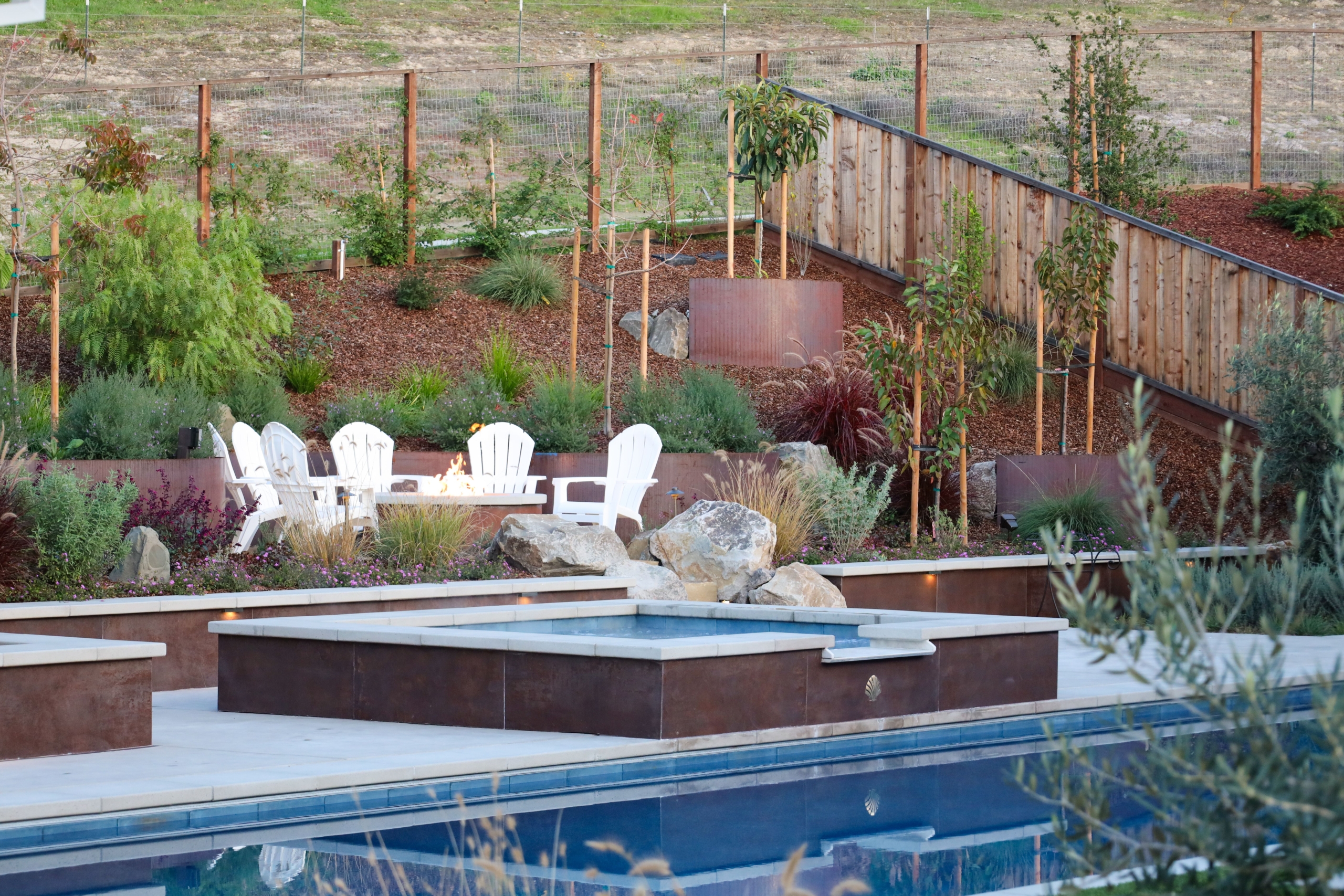
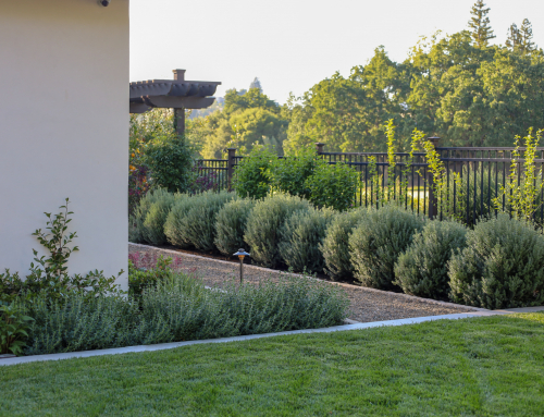
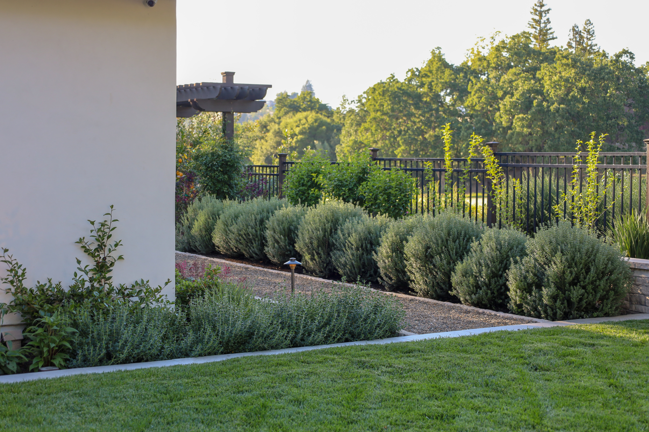
Cool colors — blues, purples, blue-greens, soft greys — create calm and visual retreat. They also recede spatially, making a space feel larger and more open. For an intimate Bay Area backyard, a palette anchored in cool tones — ceanothus, lavender, agapanthus — can make a compact space genuinely breathe.
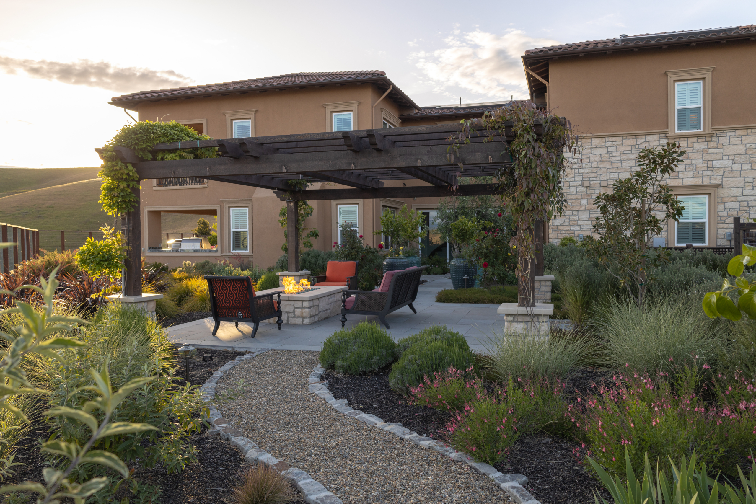
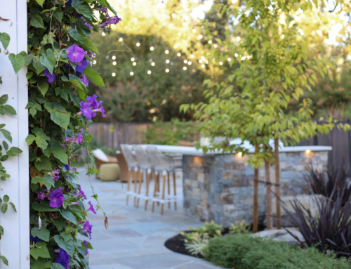
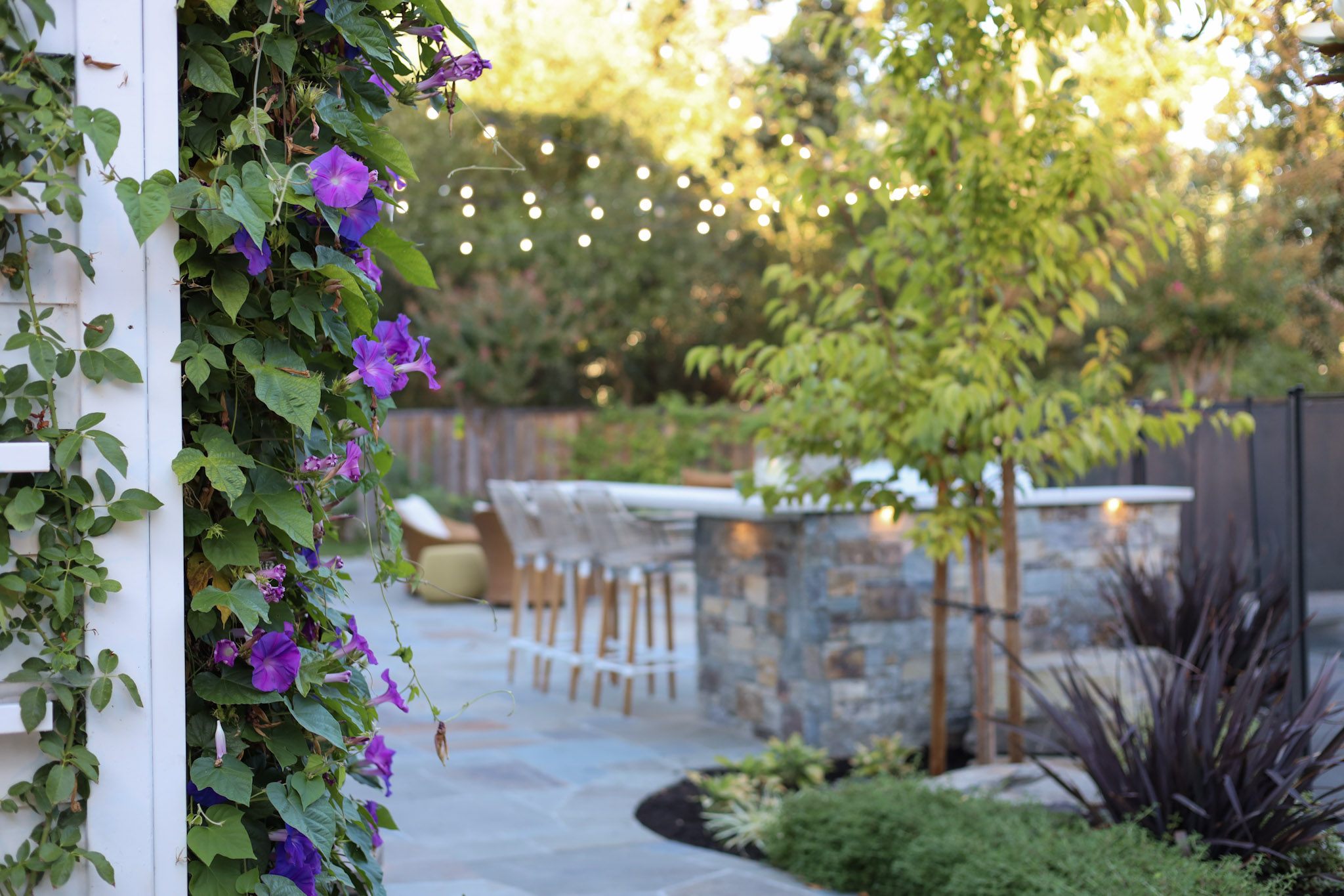
Warm colors — reds, oranges, and warm yellows — advance visually, drawing the eye and generating energy. In a large open landscape, warm-toned plantings anchor focal points and create natural gathering energy, evoking feelings of warmth, abundance, and celebration.
Dark foliage — deep burgundy Loropetalum, near-black Phormium, chocolate-toned grasses — adds drama and depth that purely green-and-flower palettes can’t achieve. One important nuance: dark foliage with cool purple undertones tends to visually recede, while dark foliage with warm red undertones advances — especially in afternoon sunlight. This distinction meaningfully affects placement decisions.
We always ask clients early in the process about their relationship to color: what they love, what they dislike, and what emotional experience they want from the space. These conversations directly shape the palette we develop together.
What’s the Difference Between Foliage Color and Flower Color?
This distinction separates a well-considered landscape from one that peaks in spring and then loses its energy for the rest of the year.
Flower color is seasonal, transient, and often spectacular — the burst of deep pink from a flowering cherry in March, the golden mass of a Fremontodendron in late spring, the lavender haze of Russian sage in summer. These are the moments people photograph and remember. But they pass.
Foliage color is the architecture of color in the garden. Present every day across all twelve months — the silver-blue of Festuca grass, the deep burgundy of a Japanese maple, the warm amber of ornamental grasses in autumn — foliage provides the continuity that holds a composition together year-round. As we explore in our post on Planting Principles, color, form, and texture are the building blocks of a successful planting design. Foliage is where all three converge most durably.
At Montgomery Robbins, we design for both: flowering plants provide the seasonal drama; foliage plants provide the palette that carries the space through every week of the year.
How Do We Design for Color Across All Four Seasons?
The Bay Area’s climate makes year-round color genuinely achievable — mild winters keep many plants visually active through January and February, while extended dry summers allow drought-tolerant California natives and Mediterranean species to carry their best color without excessive water.
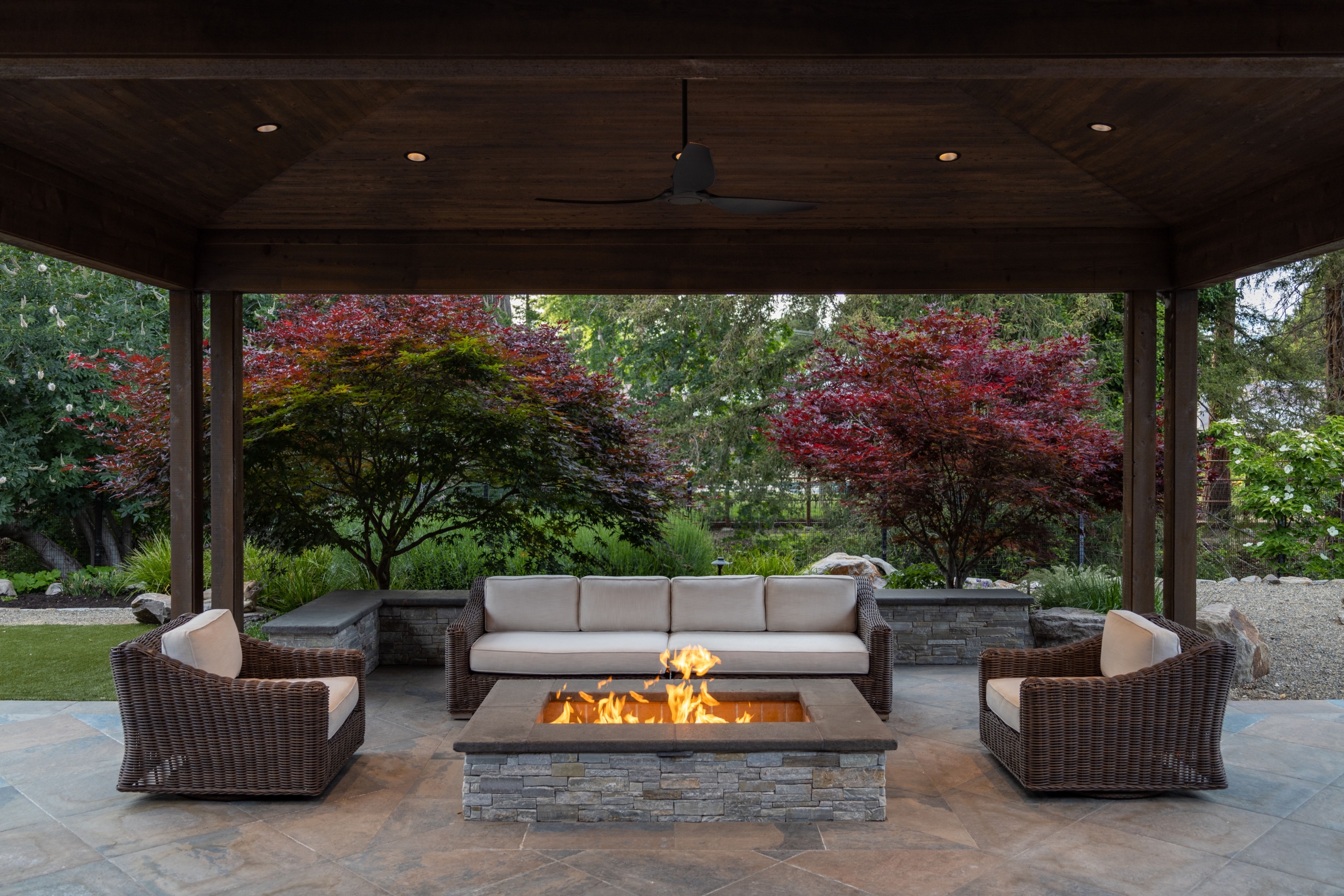
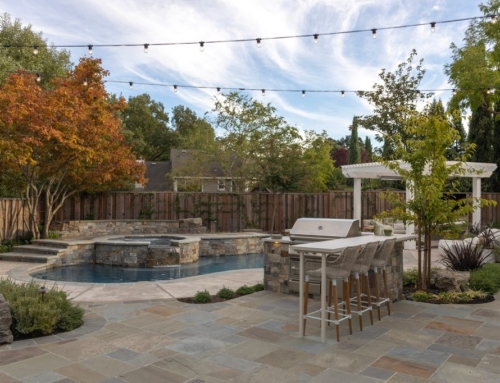
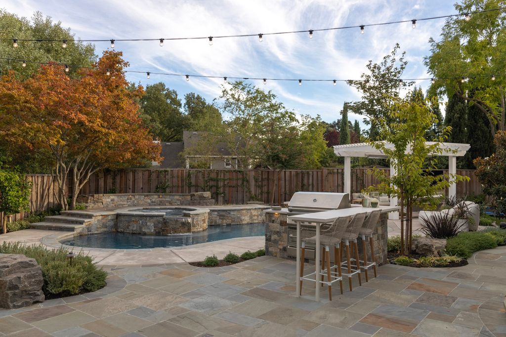
A well-designed seasonal plan might look like this: winter structure from evergreen foliage in silver, burgundy, and deep green; spring drama from native perennials and ornamental shrubs; summer color from salvias, agapanthus, and ornamental grasses catching the light; and autumn transitions from Japanese maple or ginkgo, whose foliage transforms the landscape for a few luminous weeks before winter returns.
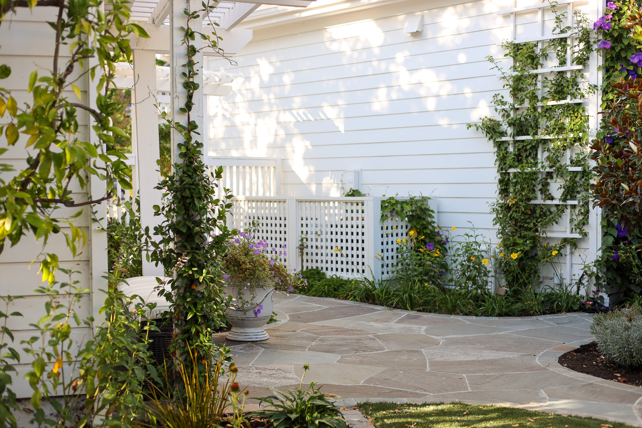
This is also why hardscape color matters so much. The stone, concrete, or tile we choose for patios and pathways — explored in our post on Timeless Stone in the Landscape — forms the permanent backdrop against which all planting color is read, across every season.
How Does Color Affect the Perception of Space?
Color is one of the most reliable tools for shaping how a space is experienced — not just seen. This is especially relevant in the Bay Area, where residential lots vary widely in size and topography.
Cool colors recede, making spaces feel more open; warm colors advance, creating intimacy and enclosure. A narrow side yard planted in cool blues and silvers can feel like a genuine garden corridor. A large open lawn anchored with warm-toned specimen plantings gains a sense of destination and arrival.
Saturation matters too. High-saturation vivid colors command attention and work best as intentional focal points — a single mass of electric-orange Helenium at the end of a path creates movement and draws the eye through the space. Repeated without restraint, that same vivid color creates visual fatigue and strips the composition of hierarchy.
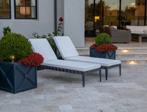
Contrast — light against dark, a pale limestone wall behind deep-burgundy foliage — adds perceived depth that makes a flat plane read as having more dimension. In smaller gardens especially, these spatial illusions are among the most valuable tools we have.
How Does a Home’s Architecture Influence the Landscape Color Palette?
The landscape surrounds and frames the home, and the visual relationship between the two is considered from the very first stages of design.
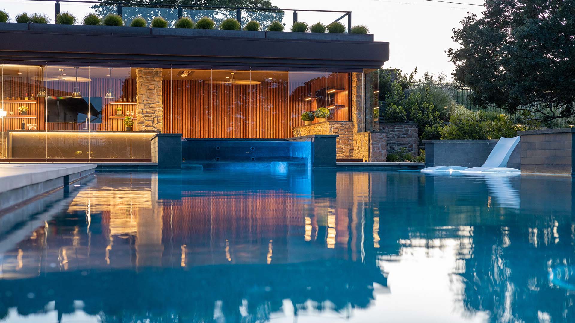
A home’s exterior palette — the tones of its stucco, siding, roofline, trim, and stonework — establishes a set of colors the landscape should respond to deliberately. For a contemporary grey-and-white home, we might lean into cool, restrained tones: silver-blue grasses, white flowering perennials, dark-leaved accents. For a warm Mediterranean home in terracotta and cream, a palette of gold, amber, and olive brings out the richness of the architecture while feeling native to the California landscape. As we’ve explored in How Details Define Luxury Landscape Architecture in the Bay Area, the color choices in the landscape are always in dialogue with the home they surround.
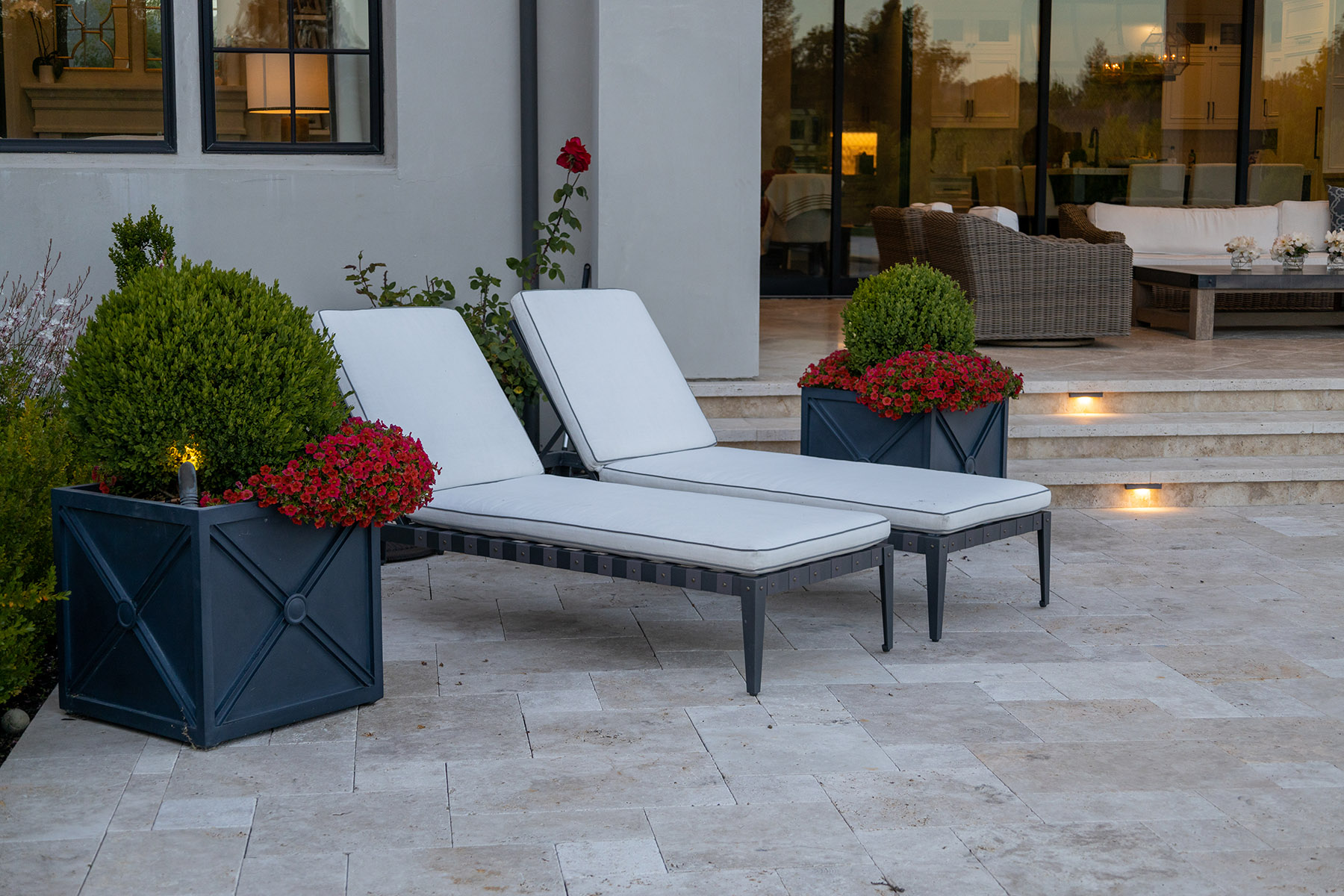
Hardscape materials add another layer: a Corten steel planter carries warm rust tones that pair beautifully with certain palettes and clash with others. A blue-grey basalt paving stone creates a fundamentally different context for surrounding plantings than warm buff sandstone. These decisions are always made with the full composition in mind.
How Does Bay Area Light and Climate Shape Our Color Choices?

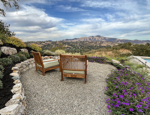
How a color reads in a garden is inseparable from the quality of light falling on it — and the Bay Area has a light quality that directly shapes every palette we design. The region’s light is famously varied by microclimate. East Bay hills properties often receive strong direct afternoon light that saturates warm colors and bleaches out delicate pastels. Properties in Marin, Tiburon, and along the Peninsula tend to receive softer, more diffuse light — cool blues and silvers that might disappear in the sun of Alamo or Pleasanton read with quiet clarity in Sausalito or Los Altos Hills. Morning fog lends an atmospheric quality to silver-foliaged plants that feels entirely intentional.
California’s native and drought-adapted palette is also perfectly calibrated to local light. The silver-grey of native Artemisia, the blue-green of Agave, the warm gold of Muhlenbergia in autumn, and the intense purples of native Salvia all read with a particular richness in California light that many non-native plants can’t replicate. Climate also governs how color evolves over time. Young plantings look different from established ones; a palette that feels balanced at installation may shift as plants mature. At Montgomery Robbins, we design for how a landscape will look at five years and at fifteen — not just at installation. That long-term perspective is central to our approach to transitional landscape design and the enduring quality we build into every project.
How Does a Landscape Architect Approach Color with Clients?
Color conversations are among our most revealing early design discussions. They surface what a client actually wants to feel in their outdoor space — not just what they think they want to see.
We begin with emotional associations. Not “do you like purple?” but “When you imagine yourself in your garden on a warm evening, what does it feel like?” These conversations quickly surface the emotional palette guiding every design decision: serene and restorative, vibrant and social, elegant and restrained, or layered and lush.
From there, we explore practical context: sun exposure and timing, views from inside the home looking out in winter when the garden becomes the primary thing you see, existing fixed elements whose colors must be honored. Throughout this process, we bring decades of experience with what actually works across the Bay Area — not just what looks beautiful in a presentation, but what holds its beauty through the dry heat of August, the grey of February, and the golden light of October. That accumulated knowledge, across projects throughout Marin, the Peninsula, the East Bay, and Silicon Valley, is what allows us to create color schemes that are genuinely enduring.
Ready to explore what color can do for your landscape? Every project at Montgomery Robbins begins with a conversation. We’d love to hear about the space you’re envisioning — and help you discover the palette that will make it feel like home. Contact us today for your consultation.